
Data Source Connection & Management
Making data management easier for marketing agencies

Problem
At AgencyAnalytics, a reporting platform for marketing agencies, data sources are the foundation of the product. Reports and dashboards rely on connected data to display information, meaning that without reliable connections, the product becomes significantly less useful.
However, the experience for connecting and managing data sources had not been meaningfully revisited in a long time. Over the years, complexity had accumulated across the experience, creating confusion for customers and making it difficult to understand the health and relationships of their connections.
Data connections were also one of the most frequently complained-about areas in our NPS feedback.
Solution
I redesigned the experience around two connected problems: connecting data sources and managing connected data.
The new experience made the underlying relationships more understandable, improved visibility into connection health, simplified common connection tasks, and created a more consistent experience across account and client management.
Because the project was large and touched critical parts of the application, I broke the work into smaller projects and iterations. This allowed us to release improvements incrementally while continuing to validate and improve the broader experience.
Role
I served as the Senior Product Designer, taking on the project outside of my regular work because of its importance to the product.
I led the design journey from research and auditing through wireframing, prototyping, prioritization, and implementation. I worked closely with product managers, developers, leadership, and our integrations team to understand the technical constraints and complexities behind the experience.
Team
Product Manager, Product Designer, Engineering Manager, 4 Developers, Leadership, Product Marketing Manager
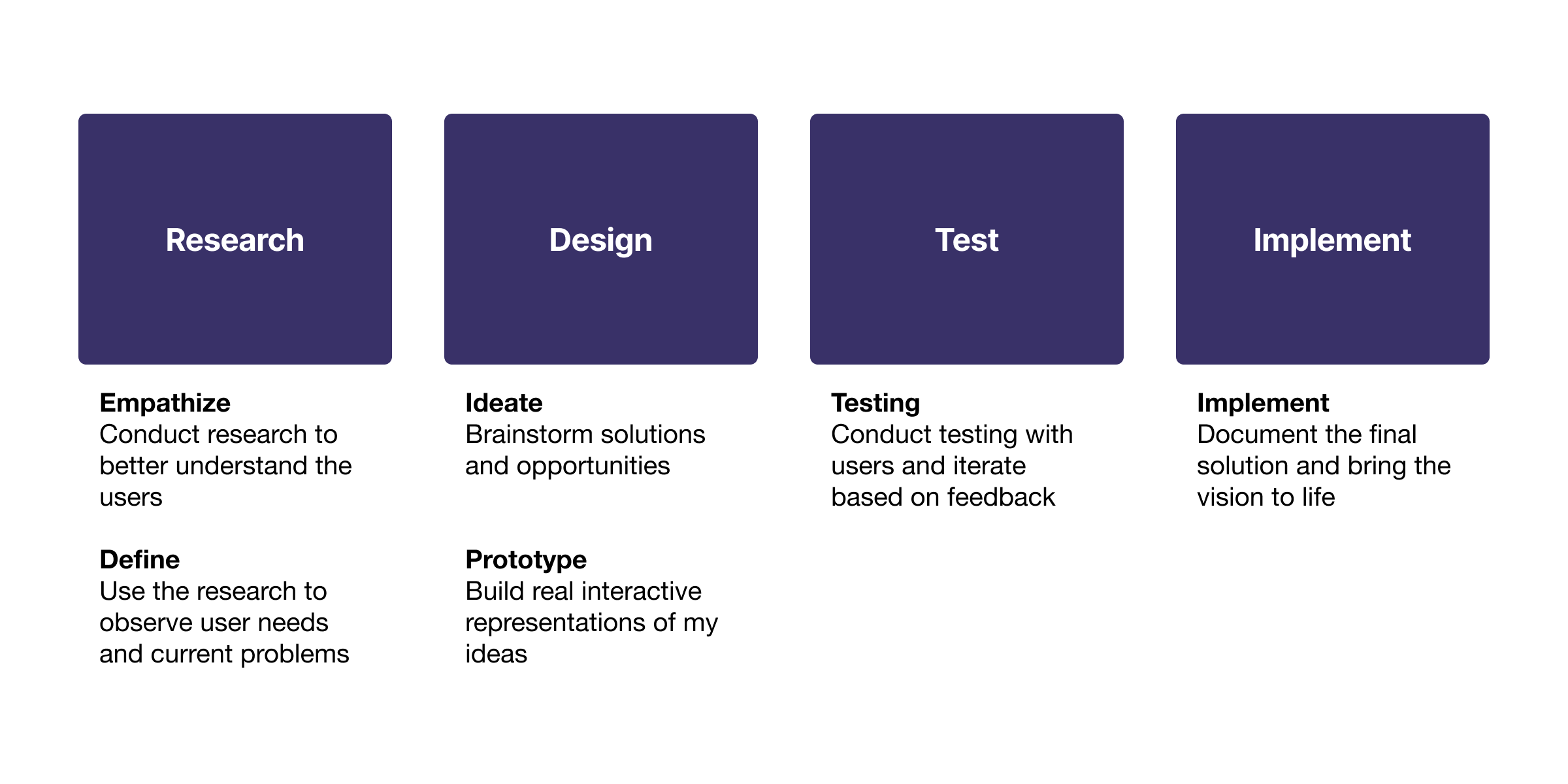
My Process
My process revolves around deeply understanding the user and their problems.
Research
Understanding the Problem
I started by looking beyond the existing UI to understand what customers were actually struggling with.
Using my product research workflow, I queried our customer request system for feedback related to data connections and management. This surfaced a large number of customer tickets and recurring pain points.
I then analyzed customer interviews and recordings to understand how people were connecting and managing their data sources in real-world situations.
Finally, I used our data analysis tools to identify important patterns and build visualizations around the information that could help inform the project.
Together, this research gave me a clearer picture of the problem space and helped organize the findings into customer needs, pain points, and opportunities.
Customers were experiencing issues such as:
Data sources frequently disconnecting
No easy way to reconnect multiple accounts at once
Confusing connection states when only a nested account was disconnected
No clear indication when a client's reporting was impacted
Difficulty understanding the state of all their integrations
Difficulty knowing which accounts were connected to which clients
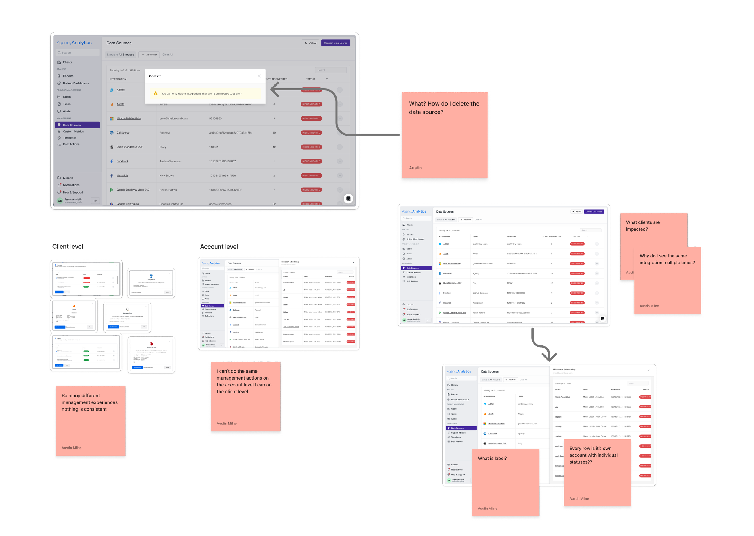
Different management experiences at the account and client levels
Inconsistent and confusing terminology
Having to manually remove connections from every client before deleting a main account

Auditing the Existing Experience
With a better understanding of the customer problems, I mapped the existing connection and management experiences across the application.
This revealed that the problems weren't isolated to a single screen.
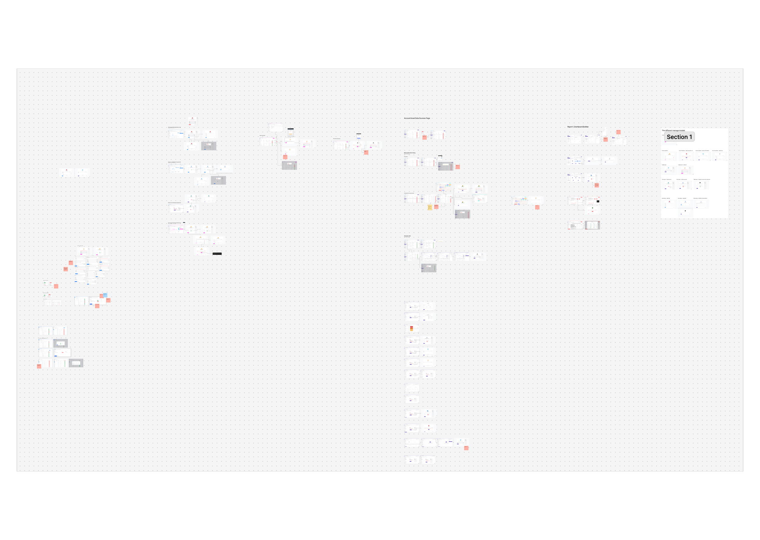
There were inconsistencies across navigation, terminology, connection states, management controls, and the way the account/client relationship was represented.
I documented the findings in an audit and reviewed them with leadership to walk through the areas of confusion and opportunities for improvement.
I also created a spreadsheet to track the findings and turn them into actionable projects that we could prioritize and monitor.
Finding the Low-Hanging Fruit
Not every problem required a major redesign.
As part of the audit, I identified smaller usability issues that could be fixed quickly without significant design or development effort. I was able to work with a developer to address some of these improvements while the larger projects were still being planned.
This allowed us to start improving the experience immediately rather than waiting for the entire redesign to be complete.
Understanding the Data Model
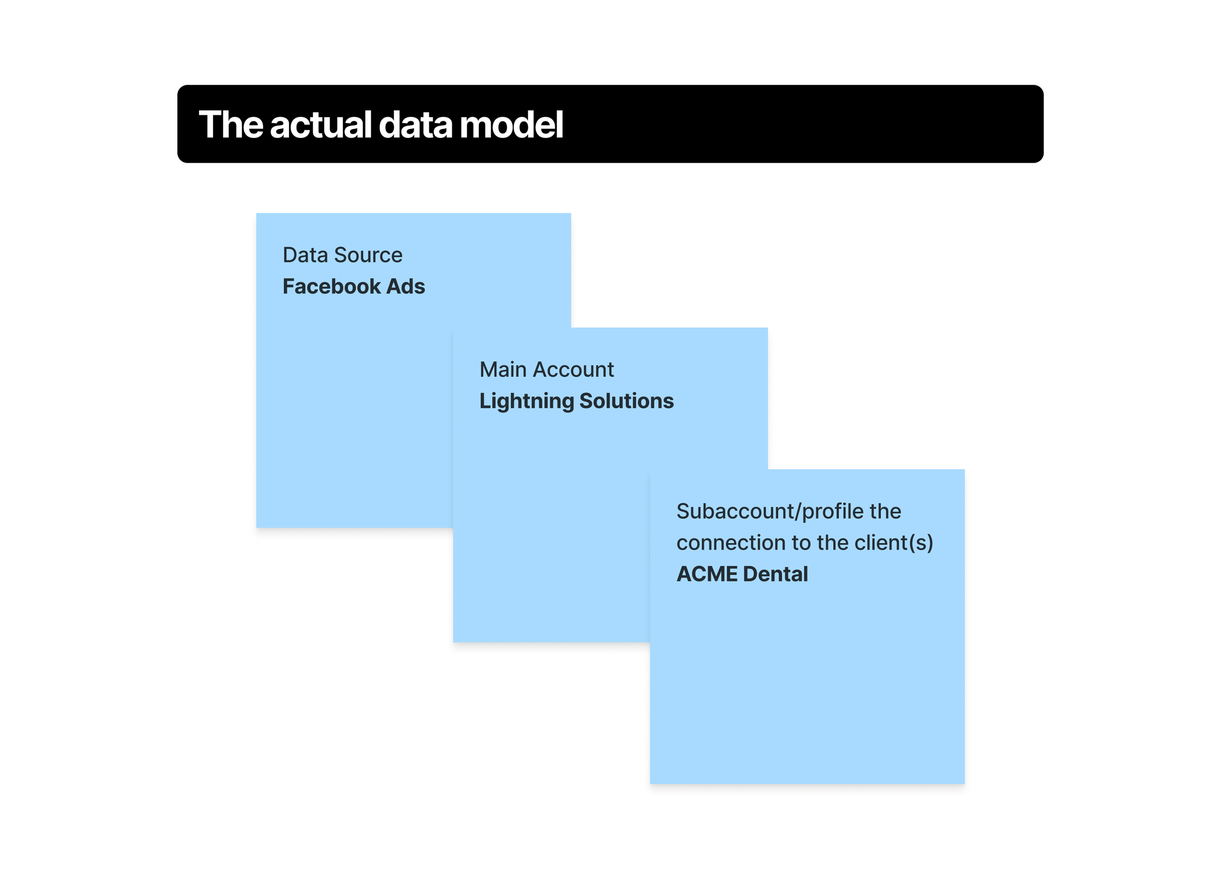
One of the most important parts of the project was understanding how connections actually worked behind the scenes.
A main integration account can contain multiple child accounts, subaccounts, or profiles. Those children can then be connected to different clients.
This meant that the UI needed to communicate a relationship that wasn't immediately obvious to users.

“It’s difficult to understand what’s connected, what’s disconnected, and which clients are affected. When something disconnects, I have to dig through multiple accounts to figure out what happened and manually fix each connection. ”
— AgencyAnalytics customer
How might we simplify account connections and management?
Connecting vs. Managing Data
The research pointed to an opportunity to simplify the entire data source experience by making connections easier to understand, manage, and maintain.
Design
Exploring Solutions Through Prototypes
I had a clear picture of the biggest problems we needed to address. Rather than immediately moving into detailed wireframes, I created a series of lightweight AI-powered prototypes to quickly explore different solutions.
These prototypes acted as design visions that we could use to discuss ideas, surface trade-offs, and evolve the experience collaboratively.
This allowed us to iterate quickly without getting too attached to any one direction. I used design reviews with stakeholders to compare approaches, highlight the pros and cons, and refine the ideas based on feedback.
I also reviewed the prototypes with the developers who would be working on the project. This helped uncover technical limitations and edge cases early, before we invested time in detailed design and refinement.
Once we aligned on the direction, I moved into more detailed designs and began breaking the work into implementable projects.

Redesigning the Connection Experience
The goal was to make connecting data sources feel simpler, more predictable, and easier to manage.
Make Integrations Easier to Find
redesigned the integration search experience to better align with patterns used elsewhere in the application.
Quick filters made it easier to browse integrations by category, while a more prominent search field supported the behavior we saw most frequently in our data: users searching directly for the integration they wanted.
Connect Multiple Accounts
After selecting an integration, users can see the accounts available to connect and select multiple accounts rather than being forced through the process one at a time.
The layout also follows our tertiary navigation pattern, making it clearer where the user is within the connection experience and which account they are working with.

Make Connection Information Visible
I introduced a more consistent connection information pattern and standard empty states.
This gave users useful information such as authentication type, synchronization timing, and the current state of their connection without requiring them to search through the application.
Identify the User
Capture whether the user is an agency or another type of business, allowing us to personalize the questions that follow.
Make It Feel Almost Done
Present questions in a modal over the app to create a sense of progress and anticipation—the product is visible behind the questions, making users feel like they're just a few steps away from getting started.
Redesigning Data Management
The management experience presented an even larger opportunity.
The goal was to make the relationship between the main account, its connections, and clients understandable at a glance.
Show the Relationship
The redesigned management experience visually represents the relationship between the main account and its connected accounts.
Instead of treating each connection as an isolated item, users can understand that these connections belong to a larger account.
I also surfaced details about the main account to make the relationship clearer.
Consistent Management Controls
Previously, management behaved differently depending on whether users were viewing the account level or client level.
I brought the management controls together so users could perform the same core actions regardless of where they were working.
See Connection Details Without Leaving
Users can now view connection details directly from the main account modal.
This removes unnecessary back-and-forth between account-level and client-level navigation and keeps the user focused on the connection they are managing.
Filter by Client
Users can filter an account to see which connections are associated with specific clients.
This makes it much easier to answer questions such as:
"Which of my clients is using this account?"
See Account Health at a Glance
I introduced a brief account overview showing the number of connected and disconnected connections.
These aren't just informational cards—they also act as filters, allowing users to quickly narrow the table to the connections that need attention.
This gives users an immediate understanding of the health of their connections before they start digging into individual accounts.
Remove Unnecessary Blocking
Previously, users couldn't delete a main account if it still had connections.
This forced them to navigate through each client, find the relevant connection, remove it, and then return to the account before they could delete it.
I redesigned this experience so users could delete the account without manually removing every client connection first.
Solving a Complex Connection Edge Case
While exploring the new management experience, a bug ticket came through involving a customer who had some disconnected subaccounts but couldn't reconnect them.
At first glance, the experience suggested the user should simply reconnect the account.
However, the underlying problem was more complicated.
The main account was still connected, so attempting to reconnect it didn't actually do anything. The disconnected subaccount had a permissions issue that could only be resolved within the external integration itself.
This was an important edge case because the problem couldn't actually be fixed from our application.
I worked with the integrations team to understand what was happening and determine what information we could surface to the user.
Together, we developed a solution that could communicate the state of the connection and guide the user toward the appropriate action rather than leaving them repeatedly trying to reconnect something that couldn't be fixed from our side.
Make Connection Health Visible
The new experience provides clearer feedback about connection health.
Rather than simply showing "Not connected," users can understand when only some of their connections are affected.
This distinction is important because a disconnected child account doesn't necessarily mean the entire integration is broken.
Exploring AI-Assisted Connection Mapping
Another opportunity emerged while redesigning connection management.
When viewing a connected account, users should be able to see all of the available subaccounts and quickly connect them to their clients.
I explored an AI-assisted approach to reduce this manual work.
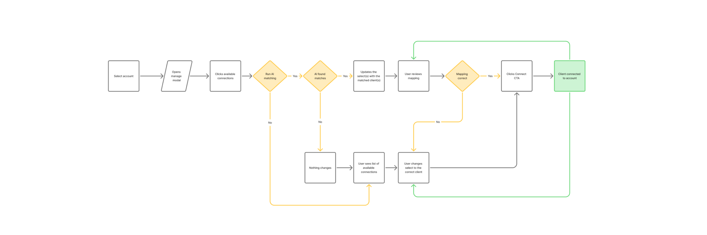
Show Available Connections
The proposed experience would show available, unconnected subaccounts in a dedicated section.
AI Mapping
AI could attempt to identify likely client-to-connection matches.
Instead of manually creating every relationship, the user could simply review the suggested mappings and make adjustments where necessary.
This turns a repetitive configuration task into a review task while keeping the user in control.
There is still an opportunity to take this further—for example, allowing users to create a new client directly from the connection management experience when a matching client doesn't yet exist.
Test
Validating the Experience
Because data connections are foundational to the product, changes in this area could have significant downstream effects on reports, dashboards, and client accounts.
We needed to make sure that improvements to one part of the experience didn't introduce problems somewhere else.
I used prototypes and design reviews to validate the new flows before development and worked with developers to identify technical edge cases early.
The customer feedback, existing support tickets, and connection issues we uncovered during research also gave us concrete scenarios to validate against.
Implement
Breaking Down a Large Problem
The scope of the project was too large to redesign and release all at once.
Rather than treating the project as one massive redesign, I broke it down into smaller projects and iterations.
I worked with the product manager and engineering manager to turn the opportunities from my audit into individual tickets and prioritize the work.
This gave us a roadmap for the larger project while allowing multiple developers to work on smaller pieces in parallel.
Smaller Improvements, Faster Value
Breaking the work down meant we could release improvements throughout the quarter rather than waiting until every part of the experience was finished.
It also gave us opportunities to validate changes along the way and identify issues before they affected more of the system.
Implementation
For each project, I collaborated closely with developers during implementation.
I provided detailed specifications for my designs, answered questions, assisted with styling, and worked through implementation constraints with the team.
I also carefully reviewed the visuals, tested usability, and checked interactions before each release.
Because data connections are foundational to the product, we needed to be particularly rigorous during testing.
A small issue in this area could have a significant impact on a customer's reports or dashboards, so we reviewed the relevant touchpoints and flows carefully before releasing changes.
Some final designs

The redesigned experience created a clearer and more consistent way for agencies to connect and manage their data sources.
Users can now more easily:
Find the integrations they need
Connect multiple accounts
Understand the relationship between main accounts, subaccounts, and clients
See connection details without navigating between different areas
Understand the health of their connections
Identify which connections are disconnected
Filter connections by client or status
Manage connections consistently at the account and client levels
Delete accounts without manually removing every connection first
More importantly, the UI now better communicates the underlying data model instead of forcing users to figure it out themselves.
A Clearer Mental Model
The experience now makes the relationship between the different levels of data more visible:
Main Account → Subaccounts / Profiles → Client Connections
This gives users a clearer mental model for how their integrations work and helps them understand what is actually affected when a connection changes.
Results
- Simplified Account Connections: Users could connect and manage multiple accounts more efficiently, reducing unnecessary steps and manual work.
- Improved Visibility: Users had a clearer understanding of what was connected, which accounts were affected, and when connections needed attention.
- Reduced Confusion: A more consistent experience and clearer account relationships made the underlying connection model easier to understand.
- More Efficient Management: Centralizing connection information and management actions reduced the need to navigate between different areas of the product to resolve connection issues.
- Stronger Foundation: The redesign established a more consistent framework for connecting and managing integrations, making it easier to build and iterate on future connection features.
What I learned
Make complexity understandable. Users shouldn't need to understand the technical relationship between accounts, subaccounts, and clients. The interface should make those relationships clear and help users understand what is connected, what is affected, and what they can do next.
Design with the system in mind. Complex products require understanding what happens behind the interface, including technical constraints, dependencies, and failure states. Working closely with the integrations team helped me design solutions that were both useful for users and realistic to implement.
Break down the big problems. Rather than waiting for a complete redesign, we were able to tackle the highest-impact problems in smaller iterations. This allowed us to deliver value sooner while continuing toward the larger vision.
Don't overlook the forgotten parts of a product. Long-standing areas can accumulate small inconsistencies and usability issues that create significant frustration. A focused audit can uncover both larger opportunities and quick wins that meaningfully improve the experience.

